
UNDER CONSTRUCTION
By all means,
take a look around.
See what's up here.
But bear with me.

Client
Sofie Muylaert
That's ME!!!
My job
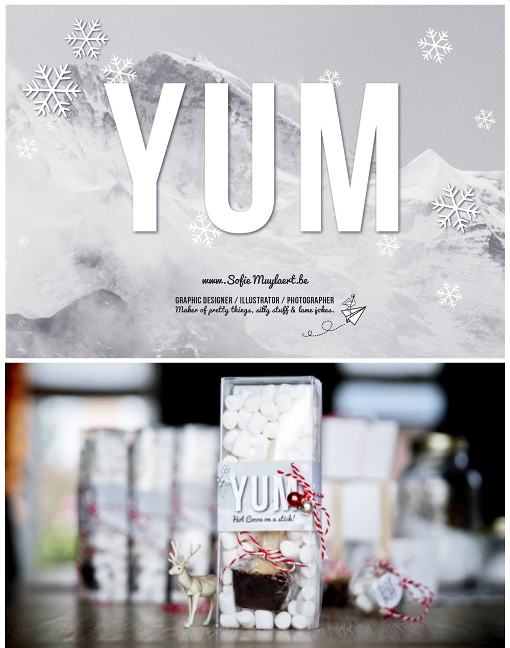
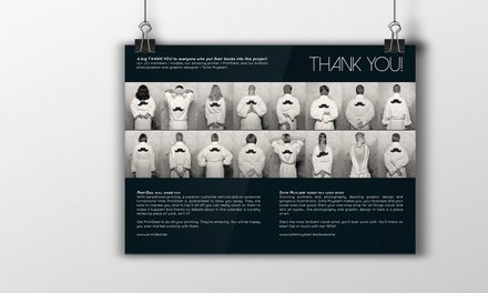
As long as I don't have clients throwing me a ton of money saying "do whatever you want with it", I'll probably keep doing self-initiated branding projects like this one.
Just for the fun of it.
Also because I really, really, really wanted to do something with those cute little marshmallows since forever.
Employer // Client
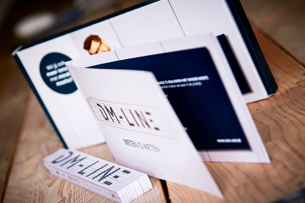
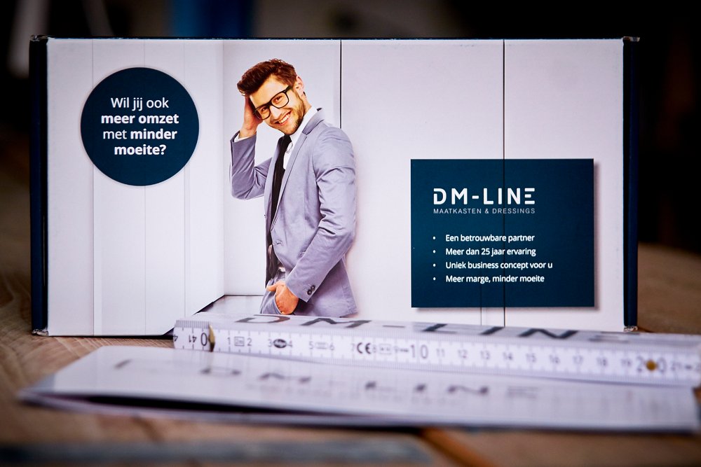
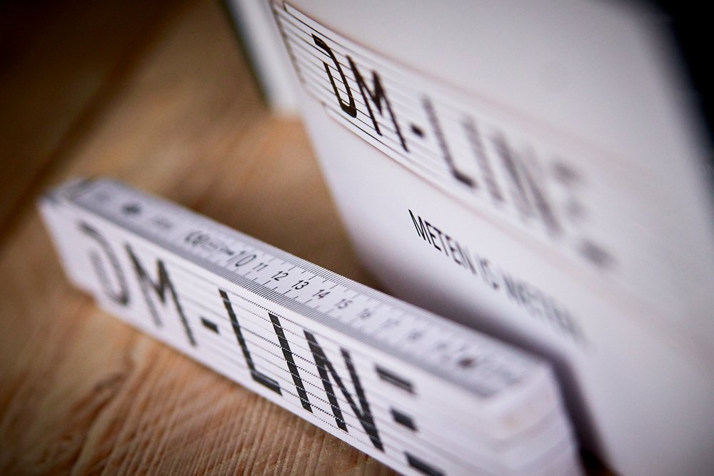
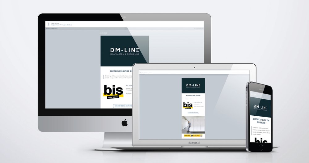
DIGITALPRINTING.be // DM-LINE
B2B Cabinetmaker
Briefing
This was part of a B2B campaign involving a Direct Mailing as well as an E-Mailing campaing. DM-LINE supplies carpenters and real estate developers with the necessary tools for building walk-in dressings and tailormade closets. They wanted a fresh and clean look, coherent with their branding guidelines.
My job
Concept - Copywriting (Baseline + Content) - Design - DTP
I was responsible for the concept and the overall look & feel, as well as designing the box, the card and the e-mailing campaign. I also did all the copywriting for this project. Getting everything ready for production was especially fun in this case. I love working on die-cut projects, which was the case aconsidering the box was tailor made.
DIGITALPRINTING.be is perfect for complicated jobs like these where print production plays a massive part in getting things done. They really do know how to get things on track even with a very tight deadline. The stunts we sometimes pull over there are exceptionnal.
Employer // Client
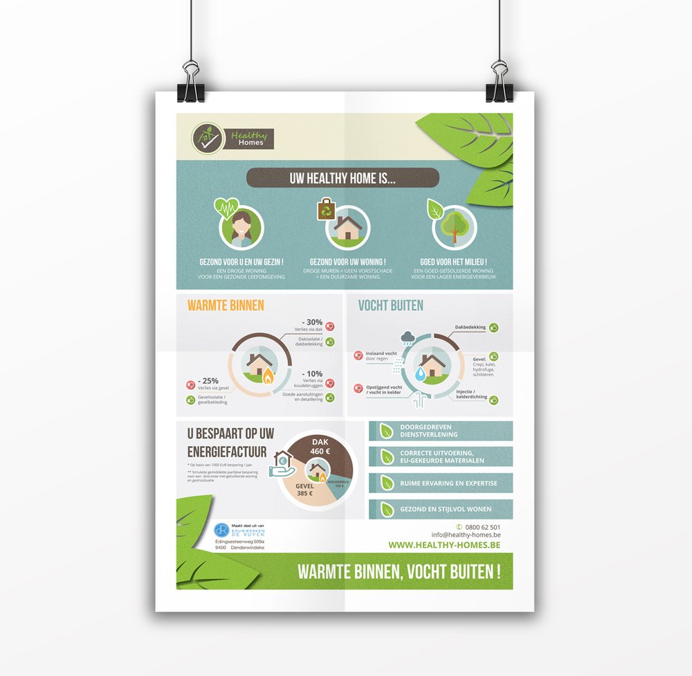
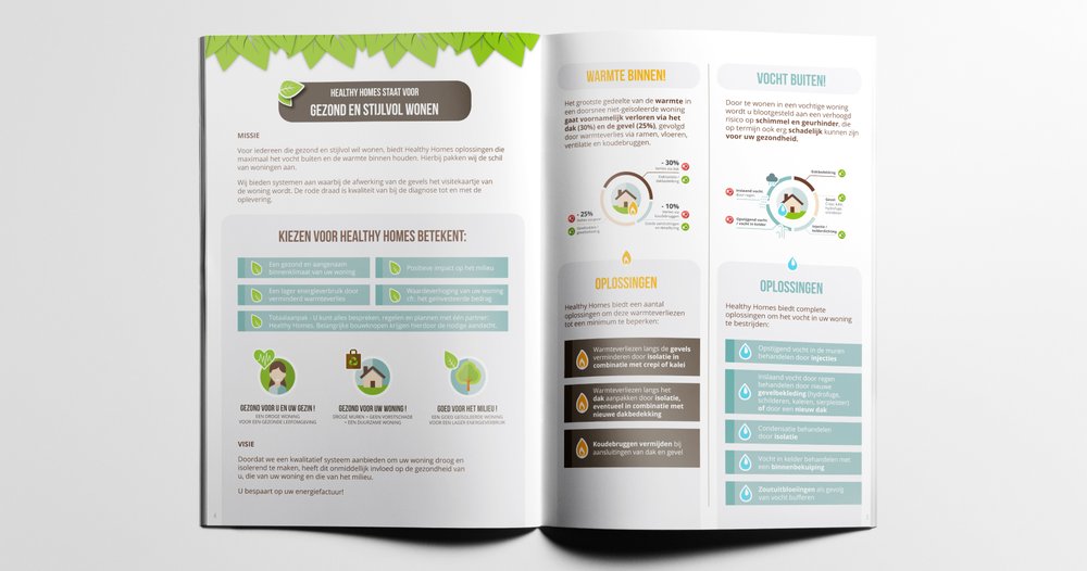
DIGITALPRINTING.be // HEALTHY HOMES
Construction & building
Briefing
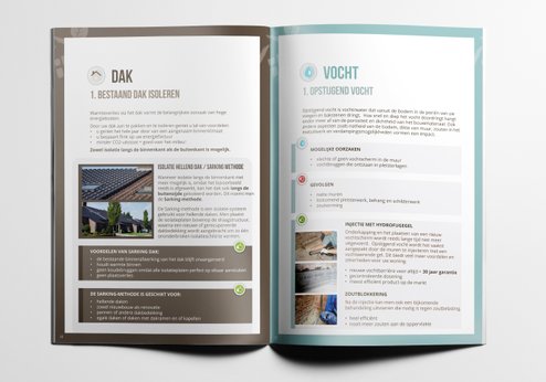
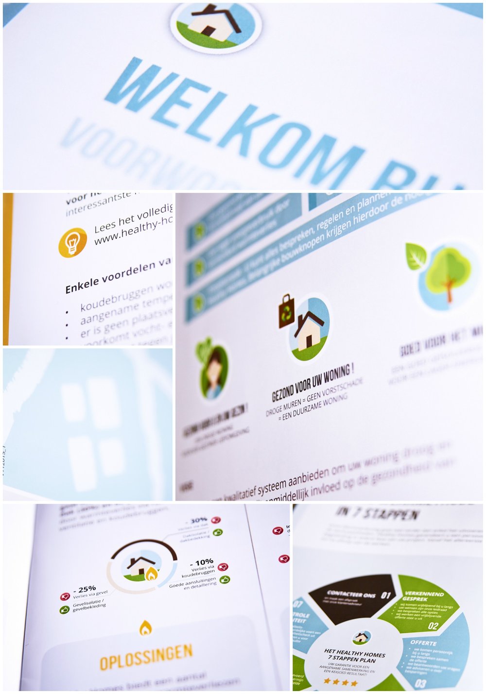
Make boring and complicated data come alive. Create an infographic to be used throughout further communications, as well as an informative brochure, flyers, doorhangers, a HUGE lightbox to be used during fairs, etc.
My job
Concept - Copywriting - Design - Illustrations - DTP // Brochure + Infographic
We knew WHAT we wanted to communicate. The key was in HOW we were going to do it.
Adding imagery an illustrations was hugely important in order to make all the facts and figures appealing to home owners . As was smart and consistent use of colour and symbols as to bring structure to a huge amount of information.
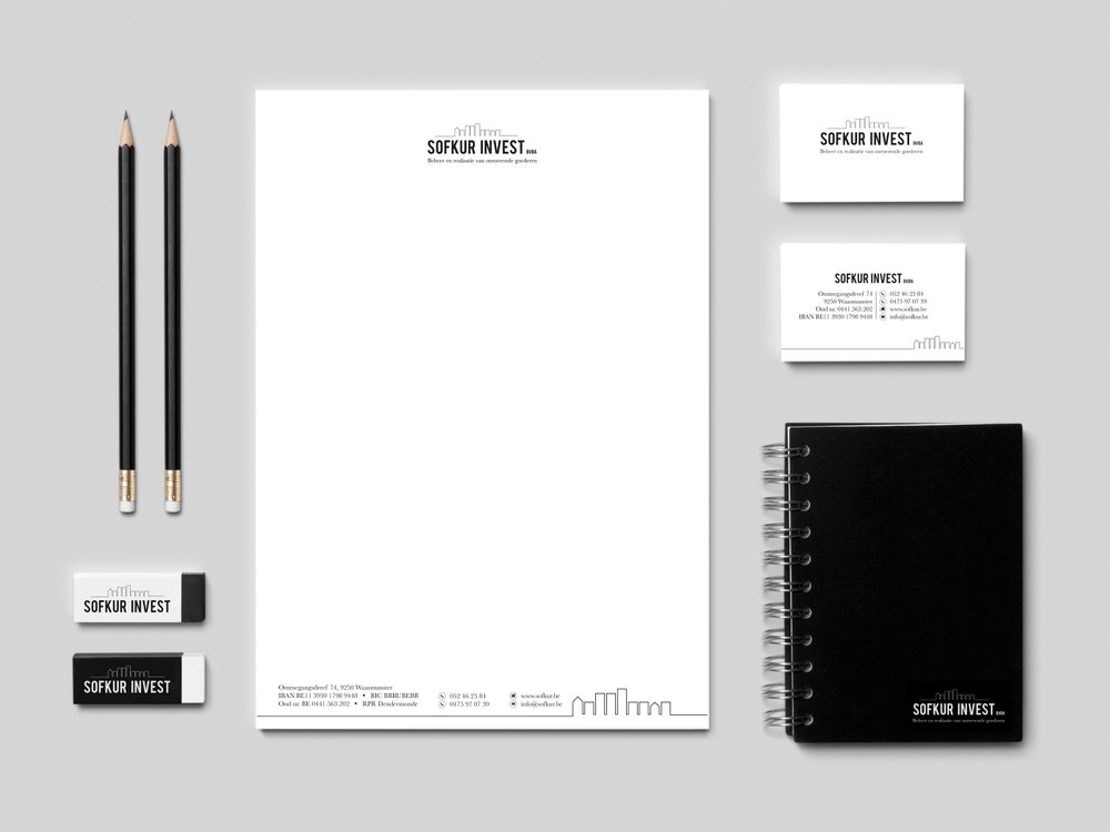
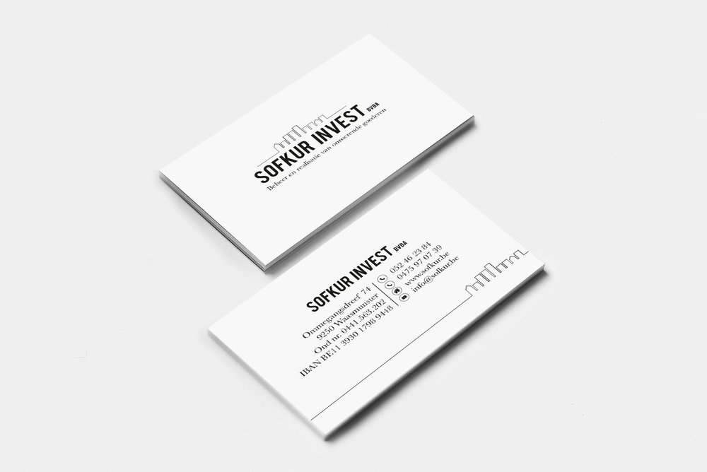
Client
Sofkur Invest bvba
(Real estate development and property management)
My job
I pretty much got carte blanche on this branding project.
I felt it needed a fresh and crisp look. Formal but with plenty of character thrown into the mix. The colour scheme (or in fact the lack of colour) and the typography play a massive role in achieving the desired feel.
FYI / BTW / TMI?
The graphic element reflects several of the client's properties. They can actually tell you which properties are used, based on the amount of floors, the type of roof and the way some of them are grouped. They're not just random buildings, you know!

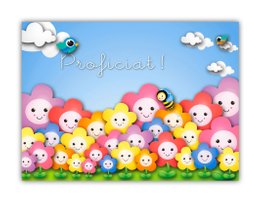
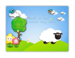
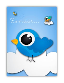
Client
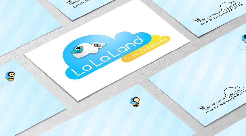
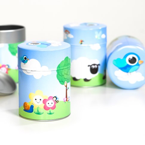
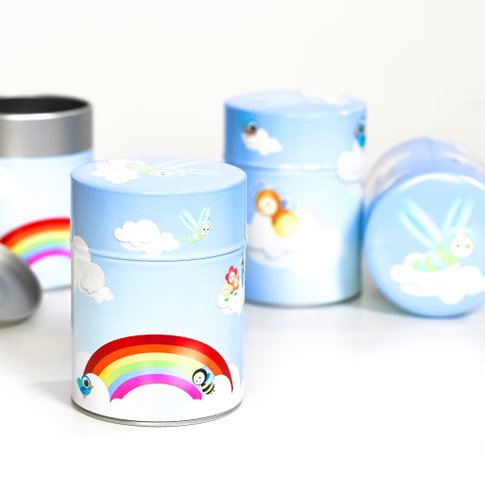
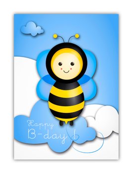
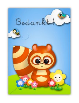
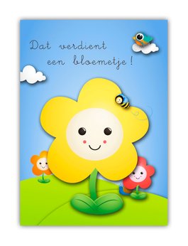
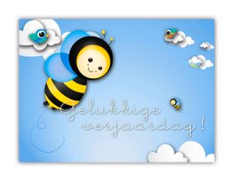
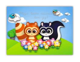
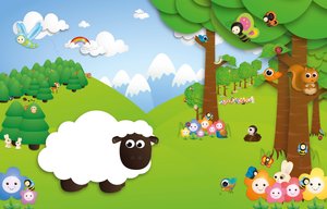
LaLaLand
(Which is ME, actually! Or more accurately... my illustrating alter ego)
My job
This LaLaLand stuff makes me smile. There really is nothing like working on happy characters you came up with yourself. LaLaLand is a long lasting work in progress. (So you should stay posted for future additions!) So far there's a range of greeting cards, candy boxes, and all kinds of trinkets. As you would expect it's all about bright colours and first grade-ish looking typography. And general cheerfulness of course.
If you're not already OD'ing on the cheerfulness and want to see more of LaLaLand, check it out here!
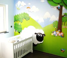
FYI / BTW / TMI?
I first started doing these illustrations as a side project. My brother and sister-in-law asked me to do a mural to decorate my baby nephew's bedroom. Something involving a sheep. Maybe a meadow. Maybe even a tree. It got a bit out of hand.
Client
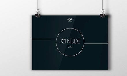
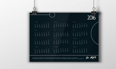
JCI Aalst
(Junior Chamber International - non-profit international organization)
The brief
JCI Aalst decided on a nude calendar as a fundraiser. Featuring JCI members. The brief was VERY short: "Do whatever you must do, but please make sure we can still show our faces afterwards!". They also wanted every page to reflect a theme relevant to their organization and activities.
My job
Concept - Photography - Styling - Design - DTP.
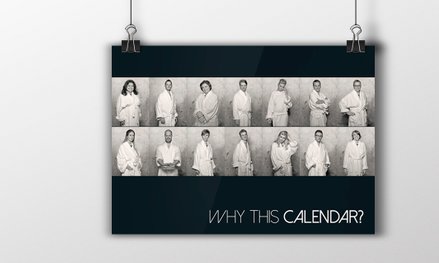
This project was in my hands from start to finish. I was responsible for the concept, the styling of the calendar and the design. I wanted everything to look stylish and classy. I presented my mood board and was able to go full speed ahead. The photography, as you can see, looks awesome. (I'm also a photographer, remember!?) I decided on a simple and elegant design to show off the photographs to best effect.

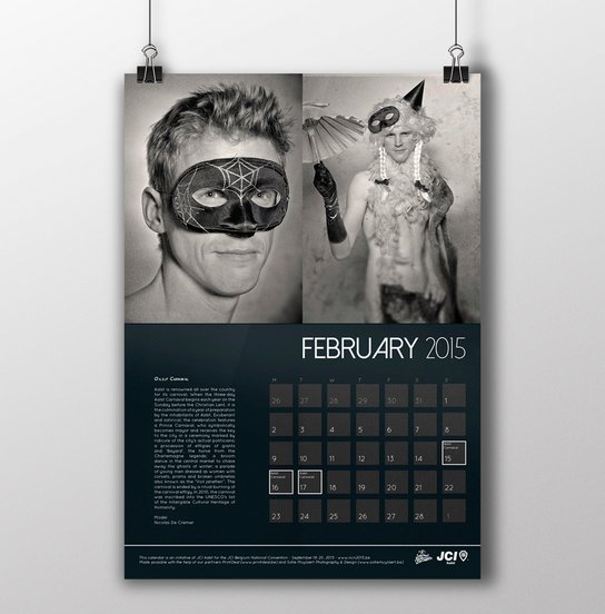
Maybe it needs some explaining...
Aalst is well known for it's Carnival. That's why we decided on a Carnival theme for the february page.
FYI / BTW / TMI?
It's impossible to tell from looking at the photographs but among the featured calendar girls and boys are business people, doctors, politicians, etc.

Client
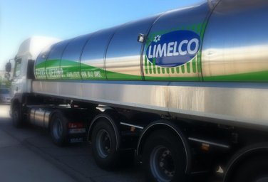
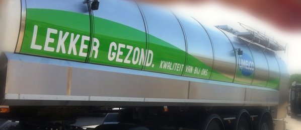
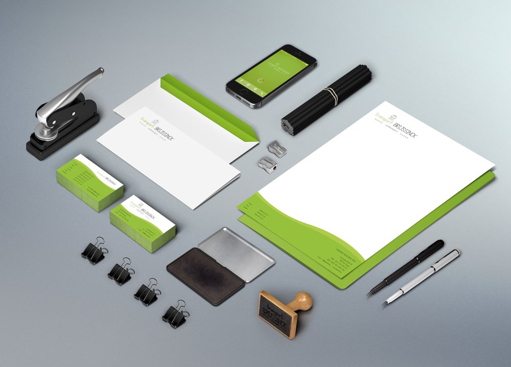
Transport Brijssinck
My job
Logo Design - Branding - Concept - Copywriting (Baseline) - Design - DTP
I used the beautiful meadows and landscapes we have around here as an inspiration for this project. We also wanted to emphasize the natural qualities of milk. That same source of inspiration was used for the baseline which highlights the natural and healthbenefits of dairy and milk.
Apart from the 'usual suspects' (business cards, letter paper, stamps, etc.) I also did the design for a series of milk tanker trucks. I must admit... it's VERY cool seeing them on the road. So far it's the 'biggest' design job I ever did.
FYI / BTW / TMI?
Transport Brijssinck is a family business. When I was working on the logo I was asked to incorporate a hand sketch made by one of the chauffeurs (who is one of two sons working in the business). It's a drawing of one of the trucks they drive and are particularly proud of. If you talk to any professional chauffeur you'll soon realise they're genuine petrol heads and are very committed to what they do.
THERE'S MORE TO COME.
STAY TUNED!